*Disclaimer: This post includes affiliate links. If you choose to make a purchase using one of my affiliate links, I will receive a commission at no additional cost to you. Thank you for your support!
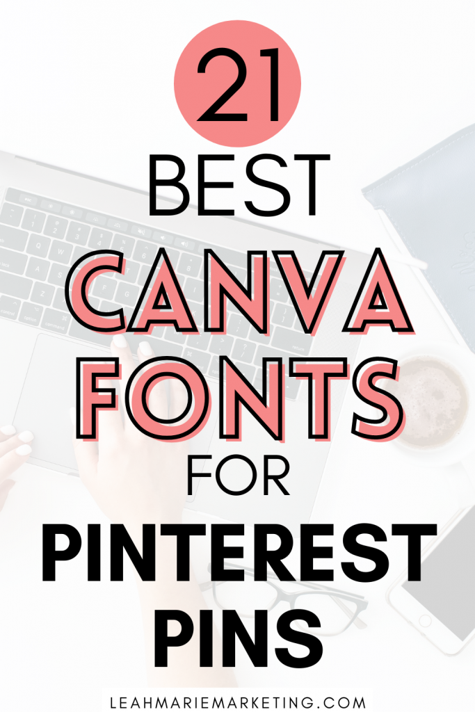
Canva is one of the best online platforms to make Pinterest pins.
When it comes to Pinterest marketing, creating appealing pins to attract and interest your ideal audience is essential. Needless to say, your pin design is a huge part of finding success on Pinterest (and in some cases, it may even be make-or-break).
There are many parts to designing pins — images, colors, fonts, titles, elements, and more.
However, this post is going to focus all on the best fonts (in Canva) to draw users to your pins.
I’m going to show you over 20 epic and FREE Canva fonts for Pinterest pins and some great Pinterest font pairing ideas.
Plus, I’ll show you how to customize Canva fonts and share my best font pin design advice that will sky-rocket your Pinterest results!
Let’s dive in.
The best Canva fonts for Pinterest pins
I’ve looked at hundreds of different fonts, and I’ve picked out about 20 that will change your pinning game.
Note: All of these fonts can be found with a free Canva account. However, with a Canva Pro account, you will have access to 3,000+ PREMIUM FONTS. (Plus, you’ll also get access to 100 MILLION+ premium stock photos, videos, and elements, and 610,000+ premium templates!)
Here are some of the best Canva fonts for Pinterest pins:
- Kollektif
- Cormorant Garamond Medium
- Hibernate Two
- Apricots
- TC Milo
- Daydream
- Lovelo
- Brixton
- Crafty Girls
- Edo
- Finger Paint
- Glacial Indifference
- Irene Florentina
- Lazy Dog
- Schoolbell
- Sniglet
- Staatliches
- Antonio Light
- Antonio Bold
- Permanent Marker
- Brittany
Keep reading to see what each of these fonts looks like!
Font examples and reviews
Here’s what each of the fonts looks like and a brief review of each:
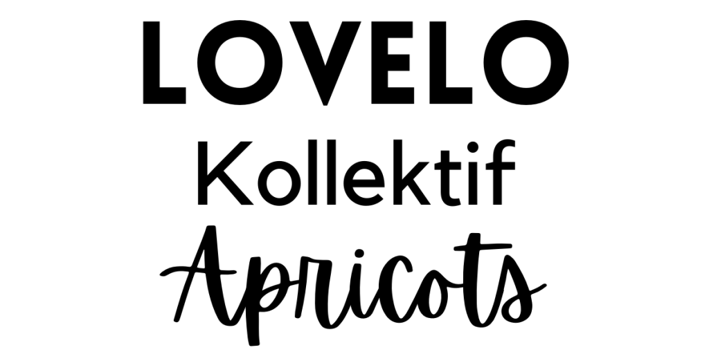
- Kollektif
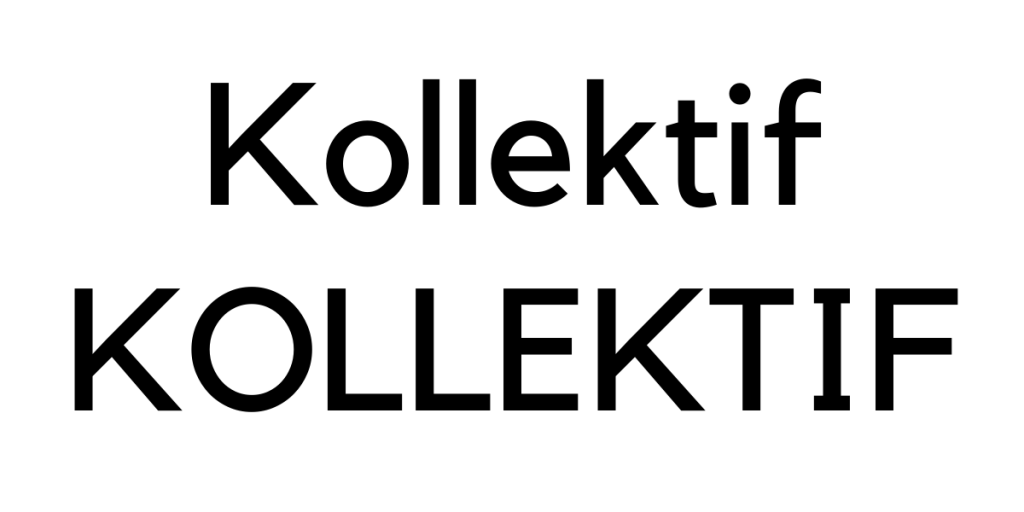
Kollektif is a bold, modern font that can easily catch the eye. It’s simple, yet very easy to read, especially on small screens!
- Cormorant Garamond Medium
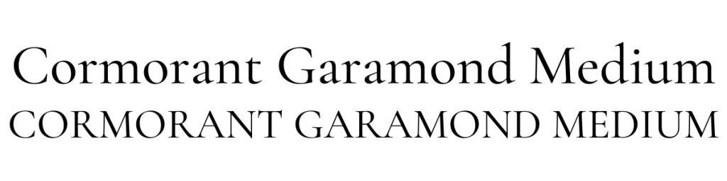
Cormorant Garamond Medium is a beautiful and light font. This is a font I used to always reach for with simple and minimalistic designs and for delicate and elegant words!
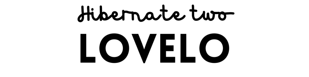
- Hibernate Two
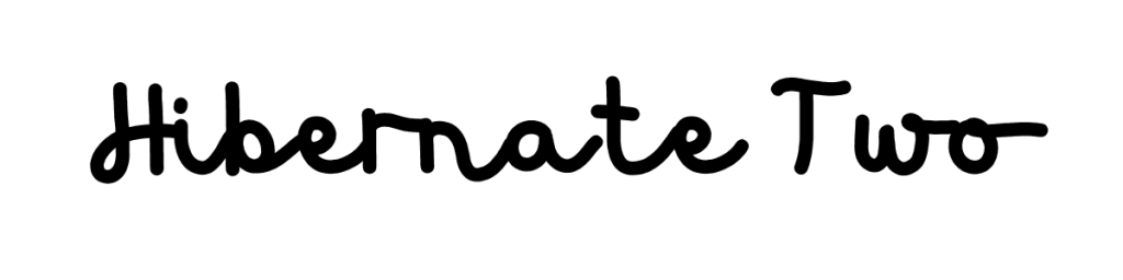
Hibernate Two is one of my favorite script fonts. Not only do I think that it’s unique, but it’s also bold and easy to read!
Note: I do not suggest using this font in all capital letters.
- Apricots

Apricots is another fun and bubbly script font that I love using from time to time. Similar to Hibernate Two, this script font is bold and easy to read. Plus, I’d definitely say it catches the eye!
- TC Milo

TC Milo is a very unique and different font. But, if used “correctly,” I think that it has HUGE potential to make your pins stand out. This is one that I’d highly recommend playing around with!
- Daydream
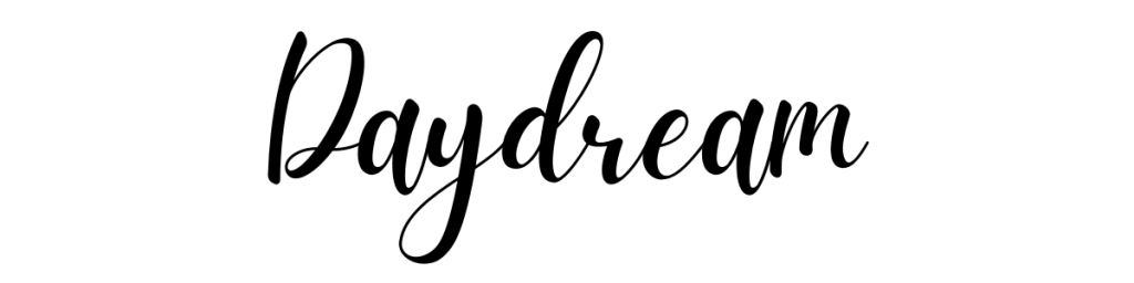
Daydream is what I like to call the “classic script font.” It’s a large yet legible script font that can add a beautiful touch to your pin designs.
Note: I do not suggest using this font in all capital letters.
- Lovelo
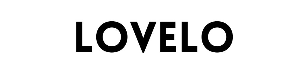
Lovelo is a font I always reach for. Honestly, it’s one of my very favorites out there! This font is a prominent, bold font that is extremely easy to read yet is very eye-catching. If you use this font on your pins, I guarantee a lot more eyes will be drawn to it in the Pinterest feeds!
- Brixton

Brixton is a beautiful, modern font that I also find very elegant. If you find that it fits your “aesthetic,” Brixon may be an excellent choice for your pins!
- Crafty Girls
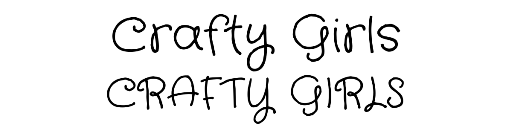
Crafty Girls is such a fun font! I have to be honest though, I don’t think every niche could pull it off (for example, I wouldn’t use it in a “finance” niche). BUT, if your in a niche such as arts and crafts, schooling, or motherhood, this may be a great font to test out!
- Edo

Edo is an interesting font that I think could really make your pins stand out! Not only is it bold, but it’s very eye-catching as well. Use this font with some of your keywords and you’ll be sure to get some eyes on it!

- Finger Paint
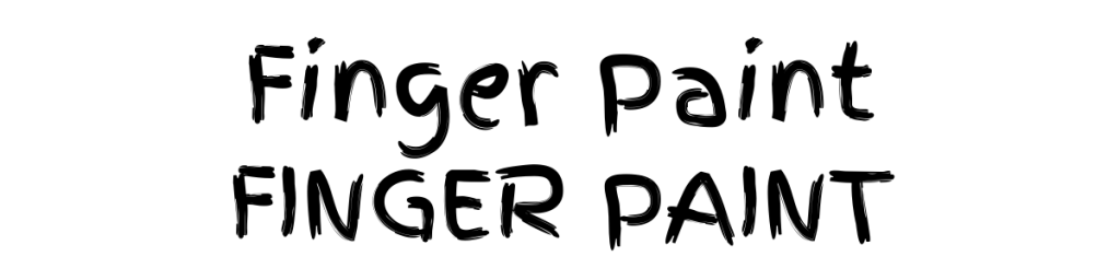
Finger Paint, like the Crafty Girls font, is another font that I could see working so well in niches such as arts and crafts, schooling, or motherhood. It’s fun, bold, and easy to read!
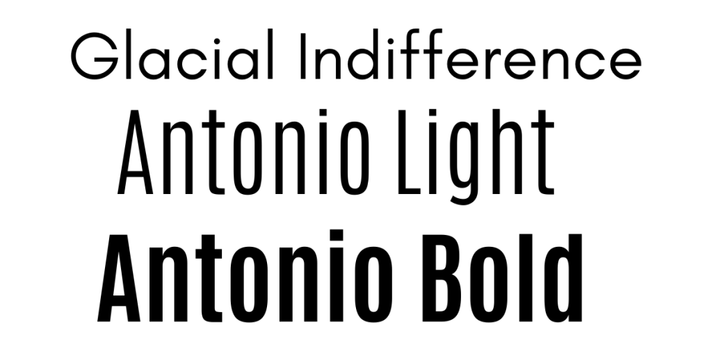
- Glacial Indifference
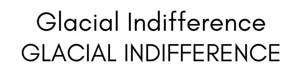
Glacial Indifference is another one of my favorite pins. (Seriously, I use it all the time!) I love how simplistic and legible it is, but it’s also so customizable and fits basically every niche!
- Irene Florentina
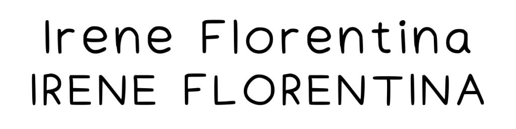
Irene Florentina is a font I immediately loved when I first saw it. It’s so simple, and I love the polished “handwriting” sort of feel!
- Lazy Dog
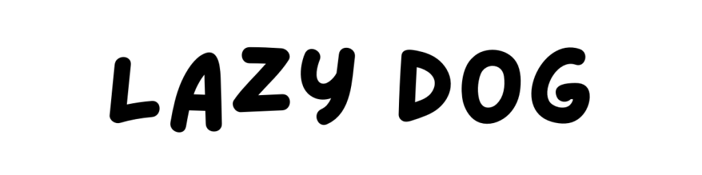
Talk about a unique font! Lazy Dog is a fun font that is nothing like I’ve ever seen. And although it’s definitely unique, I definitely think it could add a pop to your pins!
- Schoolbell

Schoolbell is yet another font that I would recommend testing out in the arts and crafts, schooling, or motherhood niches. It’s a simple font, but I love the way it looks!
- Sniglet

Sniglet is a great bold and legible font to use! I really like how this font looks very clean but has a round, spacious feel to it. It will definitely stand out on your pins!
- Staatliches
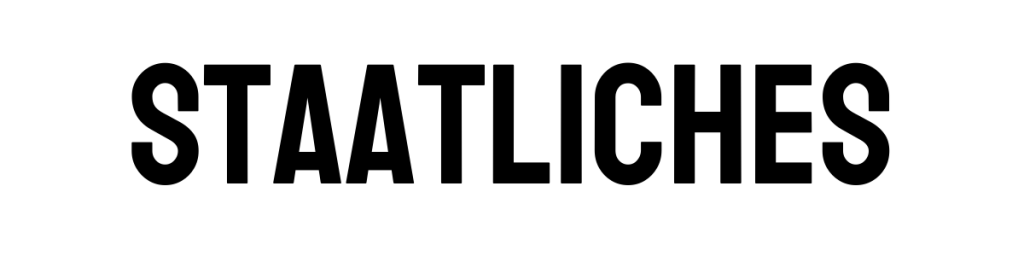
Staatliches is a compact and bold font that will easily attract some views to your pin. While I wouldn’t use this as the only font on your pins, it’d be a great pin to use for some accents or even keywords!
- Antonio Light

The next two, Antonio Light and Antonio Bold, are essentially the same font but with different thicknesses. I think there’s a time and a place for both, and I’ve used both on some of my pins in the past and I’ve seen good results with them!
- Antonio Bold

Antonio Bold is a much thicker version of Antonio Light, which is great to draw attention and highlight keywords!
- Permanent Marker
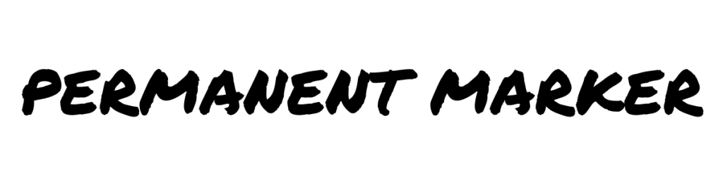
Permanent Marker is another one of those fonts that may not be great for all niches, but some could definitely pull it off! It’s a very bold and edgy look that would be perfect to make your keywords stand out.
- Brittany

Brittany is a beautiful script font that gives off an elegant and fancy vibe. When I’m looking for a handwritten script font like this, I find that Britany is one of the best because it is one of the easier ones to read. Be careful with it though! Make sure you make this font BIG so viewers can read it! Also, only use this font if you really feel that it fits what you’re looking for — since it is a thin script font, it can be a bit risky!
Note: I do not suggest using this font in all capital letters.
5 great font pairings for pins
Now you’re probably wondering, what fonts work well together?
There are some font combinations that I always use that make pins look attractive (while also being easy to read)!
Here are some great font pairings you can consider using to make your pins stand out. (Plus, you can add or remove some fonts to create pairings that you love!)
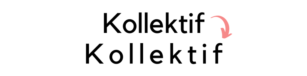
- Lovelo, Kollektif, Apricots
One of my other favorite combinations is just using Lovelo and Kollektif (or Glacial Indifference) together! (It’s super bold and easy to read!)
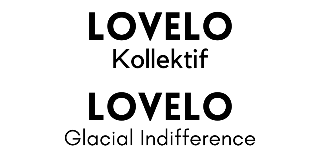
- Glacial Indifference, Antonio Light, Antonio Bold
- Kollektif, Daydream

- Hibernate Two, Lovelo
- Edo, Kollektif

How to customize Canva fonts
Did you know that you can customize each and every font in Canva? (I didn’t know this for the longest time!)
But when I figured it out, it changed my pin-making game.
While the fonts listed above are great on their own, adding some customizations can make them even more appealing and eye-catching!
Here are some ways you can customize your fonts:
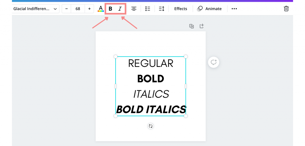
- Bold and italicize
The most basic, but they can really improve your pins!
I particularly like using the “bold” feature, and I use this to emphasize my keywords.
To bold or italicize a font in Canva, click on the text box or highlight individual words that you’d like to customize, and click on the “bold” or “italicize” button as seen here:
- Spacing
Another customizable option that I play around with is spacing.
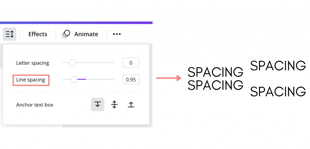
You can alter the spacing of 2 things: the line height and the letters.
Oftentimes, I like to change the spacing between the letters. Here’s what it looks like:
To change the spacing in Canva, click on the “Spacing” option:
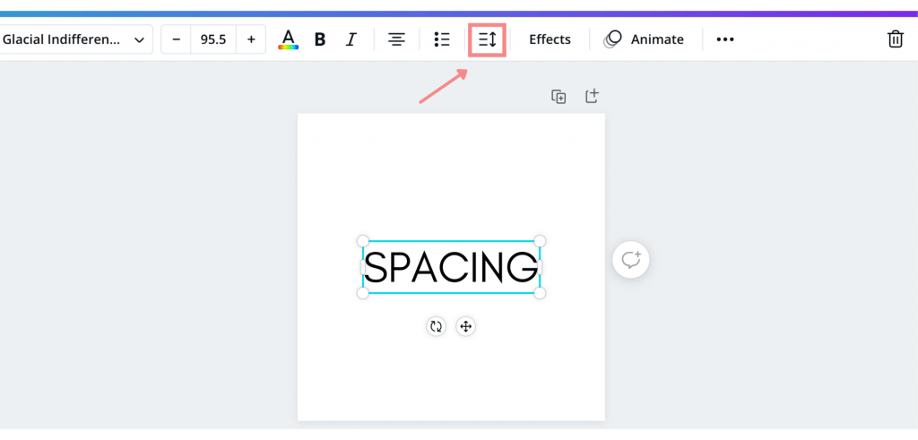
To change the spacing between letters (as shown above), slide the “Letter spacing slider.”
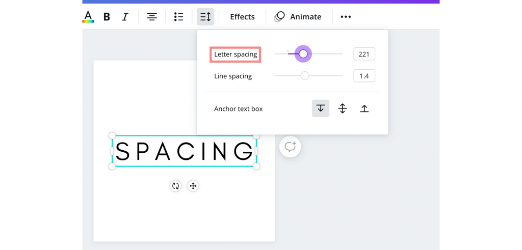
You can also change the spacing between lines by toggling with the “Line spacing” slider:
- Adding effects
Another way to customize your fonts is by adding effects.
(This is my favorite way to customize fonts!)
If you try these out, you will seriously look like a professional pin-maker.
To add effects, select the text box of the words you’d like to add effects to and click on the “Effects” option in the upper left-hand corner of the screen.
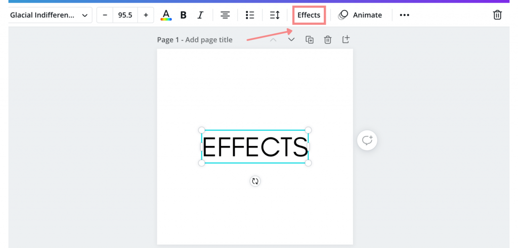
When you select this, a drop-down should appear with numerous effect options.
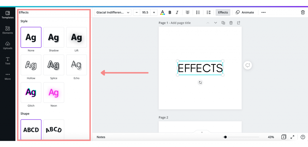
Experiment around! There are so many fun and eye-catching effects that will transform your pins.
Here’s what the effects look like after a little bit of altering:
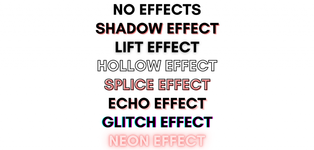
Some of these effects definitely work better on pins than others.
Some of my favorite font effects to use on pins include:
- Splice effect
- Shadow effect
- Lift effect
- Hollow effect

How many fonts should you use on each pin?
You should use three or fewer fonts per pin. Oftentimes, even two (and sometimes one) will work just as well or even better!
Using lots of pins can be really distracting and overwhelming.
Font pairings (like some of the ones that I listed above) will give you some great ideas of fonts that work well together.
Also, don’t go too crazy with the script fonts. (I suggest only using one per pin at most!)
Branded fonts on Pinterest
Did you know that fonts can be part of branding for businesses?
Some businesses like to use the same 2-3 fonts on their pins to help with their branding on Pinterest.
Branding can be great for brand awareness — but it is definitely not necessary (especially for bloggers).
But, if you want to brand your pins, branding your fonts is a great place to start.
How do you choose fonts for your brand?
Here are some tips that may help:
- Find some (easy to read) fonts that represent you or your business’s personality, aesthetic, or vibe.
- Choose 2-4 fonts that you want to use on your pins.
- Save your fonts! With a Canva pro account, you can save fonts to your brand kit so you can very easily access them while designing pins.
Keep in mind, having branded fonts is definitely not necessary to find Pinterest success. Plus, it can always evolve over time as well!
Best pin design tips for fonts
Fonts are important, but the ways in which you use fonts are even more important.
On top of only using 2-3 fonts per pin, there are a few design tips you should keep in mind.
Here are some crucial pin design tips for fonts that can help to skyrocket the engagement on your pins:
- Make your fonts and words stand out.
If your fonts and words don’t stand out, it won’t grab the attention of pinners while they’re scrolling and no Pinterest users will engage with your pins, which is the entire goal of Pinterest, right?
Crazy enough, Pinterest can essentially READ the words on your pins. (In fact, this is part of Pinterest SEO!)
So, making your pins easy to read can not only help users scrolling by the pin, but it can help Pinterest to better understand your pin and distribute it.
Here are ways you can make your words and fonts stand out more on pins:
- Use colors that stand out from the background image. (Pin images with lighter backgrounds generally perform better, so try to use darker fonts with lighter backgrounds.)
- Try to use bold fonts.
- Use vibrant colors that attract the eye (but avoid light colors like yellow).
- Use capital letters.
Using capital letters (except with script fonts) has worked very, very well for many pinners (including myself)!
At the very least, you definitely want your main keywords on the pin capitalized.
Be sure that the words are easy to read in capital letters.
- Use fonts that are easy to read.
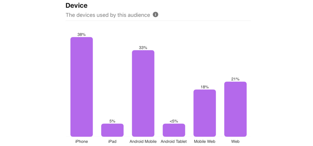
Don’t underestimate the importance of easy-to-read fonts — it’s super important that your pins can be easily read by viewers who are scrolling through their feeds (especially since Pinterest says 85% of Pinterest users use the mobile app)!
You can see this in this screenshot from the Audience Insights of all Pinterest users:
Your pins are your chance to draw in users and get page views, sales, clients, etc.
If users can’t read your pins, they will not engage with them.
It’s that simple.
(This is the reason that script fonts are super “iffy” — some can be difficult to read, especially when you’re quickly scrolling on Pinterest!)
- Make your words and fonts BIG!
Don’t be afraid to fill a lot of space on your pins with your words!
Your words should be the focal point of your pin.
I mean, let’s be honest — images and a great pin design can help, but users generally click on and engage with pins if they have a stand-out, interesting, attention-grabbing title.
(PS – This course by Carly from Mommy On Purpose, who uses Pinterest to get 150,000+ PAGE VIEWS PER MONTH is one of my favorite pin design courses. Pinterest Title Traffic Hacks For Bloggers shows you how to write incredible pin titles that users will click on and engage with! This course can be absolutely game-changing for your Pinterest account, and I saw great results when I used the tips from this course. Check out the course here!)
And as just mentioned, a majority of Pinterest users are on mobile. On mobile, multiple pins show up in the Pinterest feeds and searches at once, making each pin super tiny, so your words really have to catch the eye.
This is even mentioned in Pinterest’s creative best practices.
Pinterest says, “Add text overlay. Text overlay is the copy that goes on your Pin image to make it stand out. Keep your copy concise for readability on mobile.”
As they say…go big or go home!
Conclusion
Pin design can be a huge factor in your success on Pinterest.
If you want to see results on Pinterest, you need to create pins that are appealing to users.
I hope my list of 21 Canva fonts helps you to design gorgeous pins that bring in loads of success!
Let me know what your favorite Canva font was in the comments below!
If you want more valuable Pinterest information so you can skyrocket your success, read more on my blog or join my email list (I provide some of my MOST VALUABLE INFORMATION to my email list!)
I hope to see you around again soon. Thanks for reading!
Leah Marie
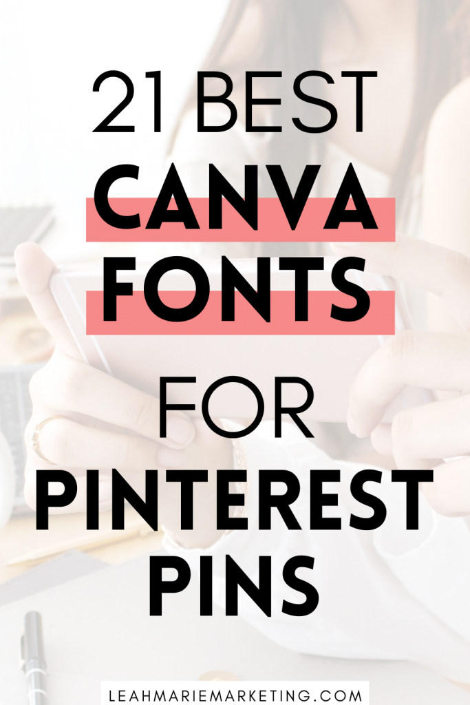
PIN FOR LATER!